User Interface (UI)
This article contains both video and written instructions for navigating the Lime Editor user interface (UI) when you have a page open for editing in Lime Editor.
User Interface (UI) Overview
When you launch Lime Editor on a page or post for editing you'll see the Lime Editor user interface (UI) which consists of four main components. These are the Top Bar, the Content Panel, the Tools Menu, and the Settings Window. All four components are shown in the image below.
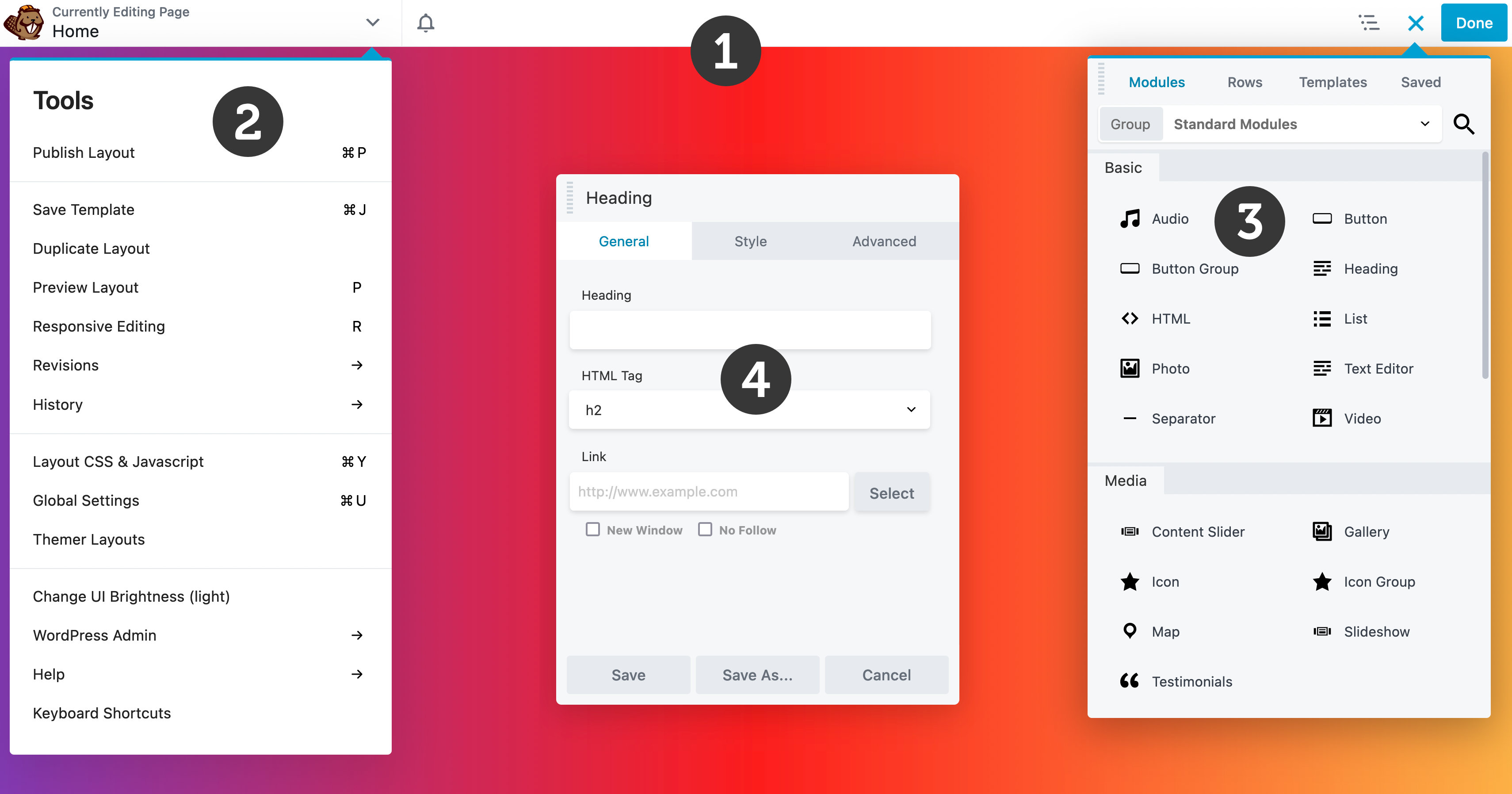
The following numbers correspond to the screenshot above.
In this section
📄️ The Top Bar
This article covers the Lime Editor Top bar which allows you to access the Content panel, Tools menu, view the title of the page or post you're editing, and more.
📄️ Outline Panel
The Outline panel provides a bird's eye view of all the content on your layout and a streamlined interface to edit and interact with layout content.
📄️ Tools Menu
Shows where to find the Tools menu and describes the options there.
📄️ Global Settings
Global settings allow you to configure certain Lime Editor settings globally.
📄️ Global Styles
Global Styles provide you with the capability to define your styling preferences for elements and colors within Lime Editor. These global styles are subsequently accessible throughout your entire website, enhancing your page builder workflow.
📄️ Layout CSS & JavaScript
Layout CSS & JavaScript allows you to configure certain Lime Editor settings globally.
📄️ The Content Panel
The Content Panel allows you to add rows, columns, modules, templates, saved content, reusable blocks, and WordPress widgets to your layouts.
📄️ Settings Window
The Settings Window can be used to configure rows, columns, and modules.
📄️ Overlay & Actions Toolbar
Shows where to find the Tools menu and describes the options there.
📄️ Link Values
The Link Values icon allows you to synchronize the values in all four directions for margin, padding, border-radius, and border-width options.