Responsive Device Toggle
The purpose of this article is to explain what the responsive device toggle is and how it helps you optimize your Lime Editor layouts for specific devices.

Introduction
Responsive Device Toggle allows you to customize the appearance of your layout's rows, columns, and modules on a per-device basis, using Lime Editor breakpoints. A device icon will appear next to options that support the Responsive Device Toggle. Every device size is represented by a different icon in order to make it easy to distinguish the device size you're currently using.
- Extra Large
- Large
- Medium
- Small
You can cycle between different device sizes by repeatedly clicking the icon, starting with Extra Large (default), then Large, Medium, and finally Small. You will be redirected to the Extra Large device size if you click the device icon while on Small.
Any time you configure an option for a specific device size in a row, column, or module, Lime Editor generates CSS code that applies those settings specifically to that device size. The following is an example of what Lime Editor CSS might look like if you used the responsive device toggle for the Heading module to set the font-size for each device.
Responsive Device Toggle CSS Example
/* Extra Large (default) */
.fl-module-heading .fl-heading {
 font-size: 60px;
}

/* Large device breakpoint */
@media(max-width: 1200px) {
 .fl-module-heading .fl-heading {
  font-size: 50px;
 }
}

/* Medium device breakpoint */
@media(max-width: 992px) {
 .fl-module-heading .fl-heading {
  font-size: 40px;
 }
}

/* Small device breakpoint */
@media(max-width: 768px) {
 .fl-module-heading .fl-heading {
  font-size: 30px;
 }
}
Usage
To use the responsive device toggle icon in Lime Editor, open the Settings Window and configure the row, column, or module as usual. Then use the device icon to toggle between the different device sizes and make the necessary adjustments. Repeat this process to adjust the option for the different device sizes.
By default, if you set an option on the default device size (Extra Large device), that value applies to every device size. Beaver's Builder's automatic responsive behavior often means that you do not have to adjust the settings any further. However, if you wish, you can fine-tune the option at each device size.
Availability
Responsive Device Toggle is available for most row, column, and module options in Lime Editor, but not all Usually, the Responsive Device Toggle can be used to control:
- Background images & positions.
- Margin & padding.
- Typography, including text alignment.
- Borders & shadows.
- Spacing within and between modules.
Examples
Here are some examples of how you can optimize the layout and design for each device using the Responsive Device Toggle, ensuring that your content looks great on any device.
Font Size
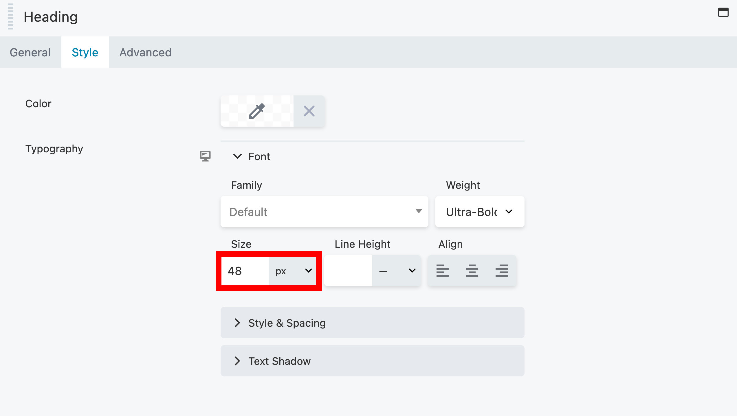
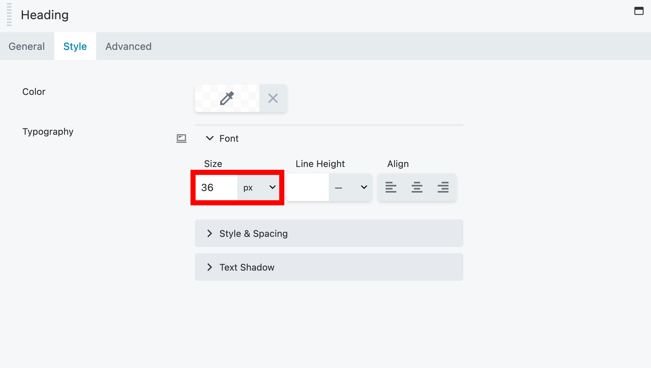
To ensure that our text looks great on any device, we use the Responsive Device Toggle, which allows us to adjust the font size of a Heading module. It is not limited to the Heading module, but can be applied to any module that has typography settings.
- Extra Large device
- Large device
- Medium device
- Small device


Background Position
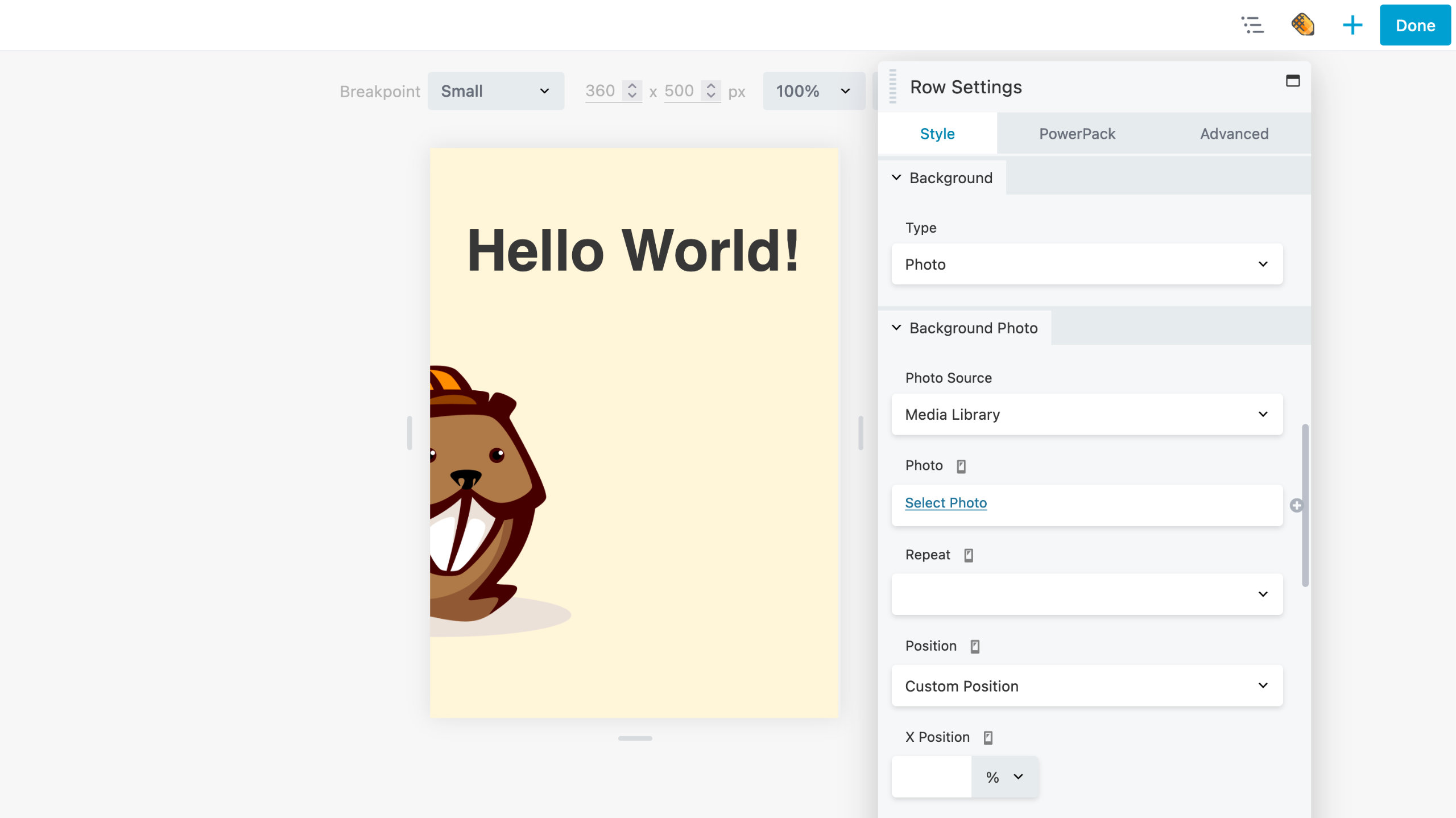
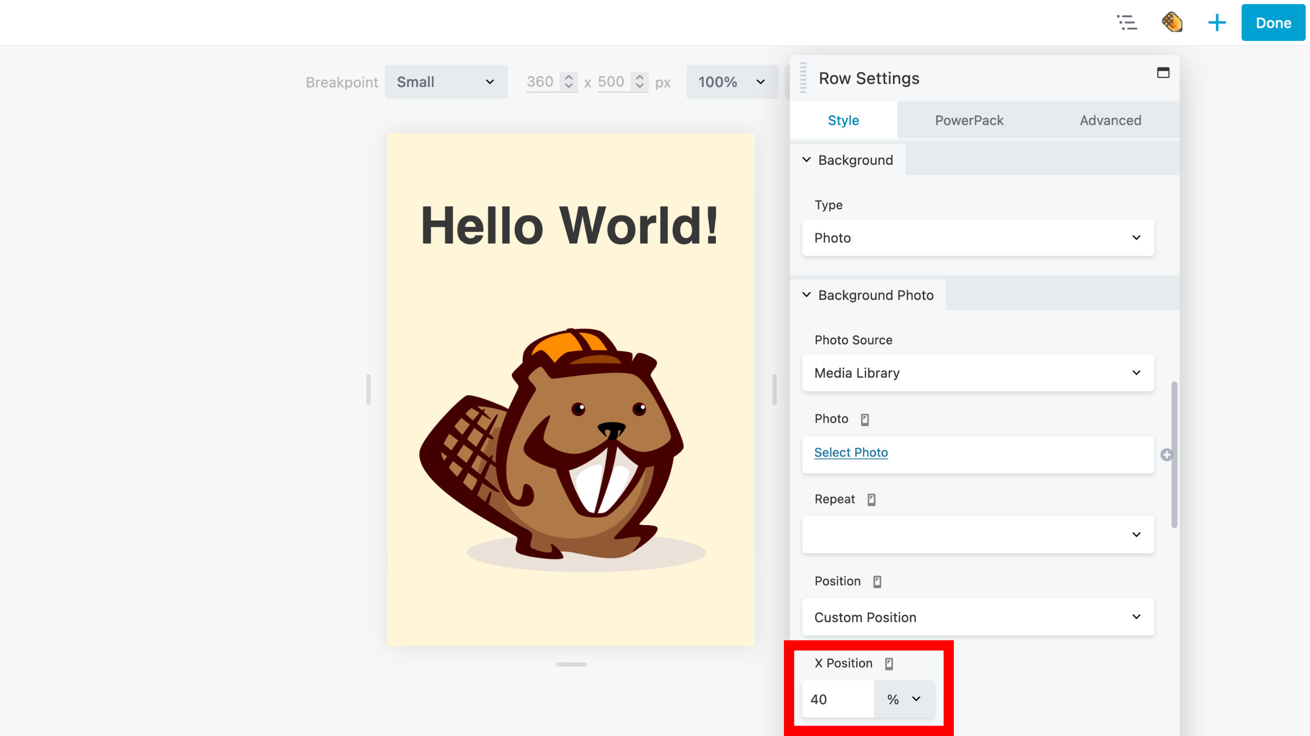
The background image may not be positioned properly on all devices. You can use the Responsive Device Toggle to reposition your background image to bring your subject matter back into focus.
The Lime Editor logo isn't positioned centrally for the small device in the example below. In order to resolve this problem, choose the Custom Position option and adjust the X Position for small devices.
- Before
- After

