Pricing Table
The Pricing Table module is a table with as many columns as you like and settings that make it easy to compare pricing and features across columns. You can control nearly every aspect of the table.
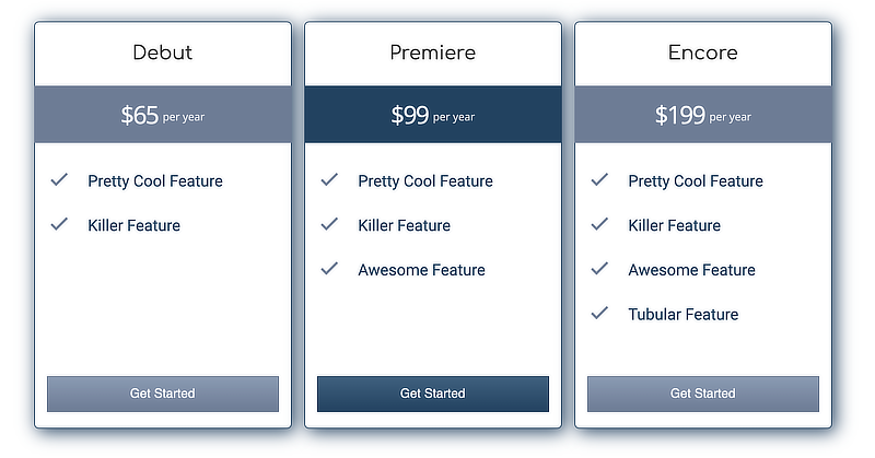
Here's an example of a simple pricing table:
Figure 1: Simple pricing table example
Pricing tables created with a previous version of Lime Editor may use a legacy border, shown in the following screenshot.
Figure 2: Legacy borders in the Pricing Table module
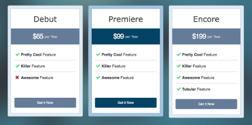
The Legacy border style has fewer customization options but is the default for backward compatibility.
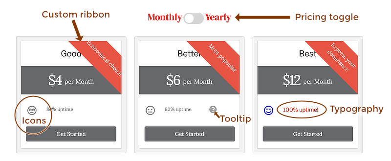
Here's an example of some of the features you can build into the Pricing Table module:
Figure 3: Example of advanced features in the Pricing Table module
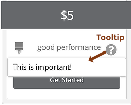
The tooltip has text that appears when the user clicks the Tooltip icon, shown in this screenshot.
Figure 4: The result of clicking a tooltip in a feature list
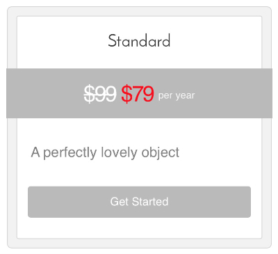
You can add HTML markup to any of the settings that accept text, such as the title, price, and features.
For example, suppose you want to show a crossed-out price with a sale price displayed in red, shown in Figure 5. In the Price field for that line, enter the following markup:
<s>$99</s> <span style="color:red;";>$79</span>
Figure 5: HTML markup example to display the sale price
Settings for the overall pricing table
Pricing Boxes tab
Pricing Options section
This section displays the pricing boxes that form each column in the table.
- Click Add pricing box to create a new pricing column.
This opens the panel with setting for individual pricing boxes - You can click an icon to the right of any existing price to move the pricing box up or down in the list, duplicate the pricing box, or delete the pricing box.
General section
- Enable dual billing
Yes creates the Monthly/Yearly toggle at the top of the page, or whatever custom billing intervals you specify. This lets users click the slider button to compare monthly and yearly prices for the items in the table.
If this feature is enabled, there are two additional settings: Billing option 1 and Billing option 2, where you can change the monthly/yearly toggle to different time intervals.
Icons section
- Default feature icon
If you want every feature in every pricing column to show an icon before the feature, such as the checkmarks shown in Figure 1, you can select the icon here. - Feature tooltip icon
By default, the tooltips are displayed with a question mark, shown in Figure 3 You can choose a different icon for this setting if you want.
Style tab
The Style tab has three sections: General style, Border, and Feature list style.
Style settings in individual pricing boxes override the corresponding general settings.
General Style section
- Highlight
You can choose which row in the column headers to highlight with a color background: the Price row, the Title row, or neither row. The default is a dark gray background and white text but you can adjust these colors on the Style tab for the individual pricing boxes. - Column height
Auto makes the length of the pricing box fit the content in the column. Equalize makes every pricing box the length of the longest one and the bottom buttons in all the pricing boxes are aligned. - Features min height
Sets a custom minimum height for the features in all of the pricing boxes. - Advanced spacing
Creates space to the left and right of all the pricing boxes.
Border section
- Border type
You have a choice of Standard (Figure 1) or Legacy (Figure 2).
The Standard border type has the regular Border section with settings for a border and border effects.
The Legacy border type has the following settings:
- Border style
This option controls the width of the border. The choices are Rounded or Straight. - Border size
The choices are Large, Medium, or Small. Figure 2 has a Large border width.
Feature List Style section
This section has styles that apply to all of the features in all of the pricing boxes.
- Show list separator
Shows a horizontal line between the features in the list. - Separator line color
Sets the color of the separator. - Feature icon size
Sets the size of icons in the feature lists. - Feature icon color
Sets the color of icons in the feature lists. - Feature text color Sets the color of the feature text.
- Feature list text typography
The standard Lime Editor Typography section for setting font family, weight, spacing, and so on. - Tooltip icon size
- Tooltip icon color
The color of the circular background behind the tooltip icon. By default, the color is gray (#808080). - Tooltip text color
The color of the text in the tooltip that appears after you click the tooltip icon. By default, the color is light black (#333333). - Tooltip background color
The color that appears behind the tooltip text.
Advanced tab
There are all the usual Advanced tab settings for margins, visibility, animations, and advanced HTML settings.
Individual pricing box settings
If you click any of the pricing boxes in the list on the Pricing boxes tab, a new panel opens with three tabs: General, Button, and Style.
General tab for each pricing box
The General tab has four sections: Title, Ribbon, Price box, and Features.
Title section
- Title
Enter the text you want for the title.
Ribbon section
- Show ribbon
If you choose Yes, there are two additional options: - Ribbon Text
Enter the text you want for the ribbon. - Ribbon position
The Top setting places the ribbon in a box above the title. The Top left and Top right choices are diagonal. If the ribbon occludes the title of the pricing box, you can adjust the Ribbon height and Ribbon offset on the Style tab.
Price box section
- Price
Enter the price you want to display. Include the currency symbol here if you want one. - Duration
If there is a duration to the price, or other information you want to display after the price, enter the text here.
Features section
This section lets you enter the individual features. Each feature has the following settings.
- Description
Enter the feature text.
If you want to enter additional settings for this feature, click the down arrow to reveal the following two settings.
Feature icon
If you want to add an icon for this feature only, select it here.Tooltip
If you want a tooltip for this feature, enter the tooltip text.
Click the Add price features button to enter the next feature.
Button tab for each pricing box
These settings are the same as settings for the Button module.
- Button text
- Button URL
- Button icon
- Button style
- Button text
- Button background
- Button border
Style tab for each pricing box
This tab has the following sections: General style, Title style, Price style, Ribbon style, and Feature list style.
General Style section
- Box color
- Accent color
- Accent text color
- Box top margin
Title Style section
- Title color
- Title typography
Price Style section
- Typography
Ribbon Style section
Here's a screenshot example of settings for a ribbon in the Top position.
Figure 6: Ribbon style settings, individual pricing box
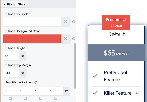
- Ribbon text color
- Ribbon background color
- Ribbon height
Sets the height of the ribbon color background. - Ribbon height offset or Ribbon side offset
Adjusts the ribbon height when the location for the ribbon is Top. Adjusts the ribbon side offset when the location for ribbon is Top right or Top left.
Feature List Style section
This section styles the individual feature icon and text and the tooltip icon and text.
- Feature icon color
- Feature text color
- Tooltip icon color
- Tooltip text color