User Interface (UI)
Open a page for editing in Lime Editor and here's what you'll see.
- #1-7 Top bar
- #8-14 Content panel
- #15 Tools menu
Click the link to go to a separate article about the Tools menu.
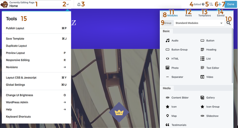
#1-7 Top bar
The following numbers correspond to the screenshot above.
1. Title bar
Shows what you're editing (page post, etc.) and its title.
2. Arrow to expand the Tools menu
See below for more information about the Tools menu.
3. Notifications icon
Click the bell icon to open notifications of news from Lime Editor.
If you have and Agency license and have white-labeled Lime Editor, this icon won't be displayed.
4. Editing status
This area is blank before you make any editing changes and shows as Edited when there are any unpublished changes, even from previous sessions.
5. Outline panel
Click the Outline icon to open the Outline panel, which displays the layout structure in an outline format:
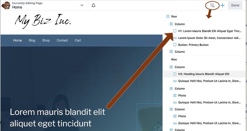
See the article about the Outline panel for more information about working with the Outline panel.
6. The Content panel show/hide icon
Click + to expand and x to close.
This icon does not appear when the panel is pinned to the left or right side of the screen. Instead, there's a show or hide icon at the bottom of the panel.
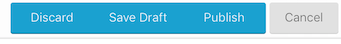
7. Done button
The behavior of this button depends on whether you've made any editing changes in this session.
- When the Done button is gray there have been no editing changes: Click Done when it's gray and you exit the Lime Editor editor with one click.
- When the Done button is blue, there have been editing changes, and the status Edited appears to the left.
Click Done to open a choice of Discard, Save draft, Publish, or Cancel.
Changes in Lime Editor are preserved as you make them. When you click Discard, you lose all saved changes since the last time you published, and only publishing creates a revision you can go back to. For more information about discarding, saving, and publishing see Instant save - Save as draft - Publish - Discard.
#8-14 Content panel
The numbers correspond to those in the screenshot at the top of the page.
8. Drag handle
Click and hold the left mouse button on this icon to drag the Content panel anywhere on the screen. You can pin the panel by dragging it to the side of the screen and dropping it into a blue vertical strip that appears. To unpin the panel, grab the top of the panel and drag it back to the center.
9. Group selection within the tab
Each tab (#9-12) is organized into groups. Click the Group box to navigate to other groups on that tab.
10. Search icon (Modules tab only)
Click to expand the search box and start typing any part of a module name.
11. Modules tab
This tab has three subgroups:
- Standard (built-in) modules
- WordPress widgets that can be used as modules
- Saved modules, organized under each module type.
Saved modules can also be accessed from the Saved tab.
There may also be groups of third-party modules, depending on other plugins you have installed.
12. Rows tab
Drag any item into your layout. This tab contains the following groups:
- Column layouts
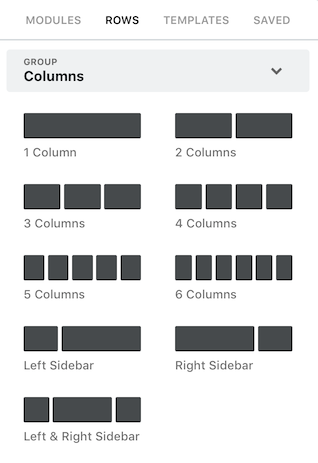
- Prebuilt rows
- Saved columns
- Saved rows
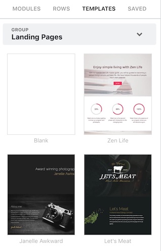
13. Templates tab
This tab displays the built-in layout templates (landing pages and content
pages) as in the following screenshot, plus any saved layout templates. Click
on any template to insert it into your layout.
14. Saved tab
Displays all your saved items grouped into rows, columns, and modules.